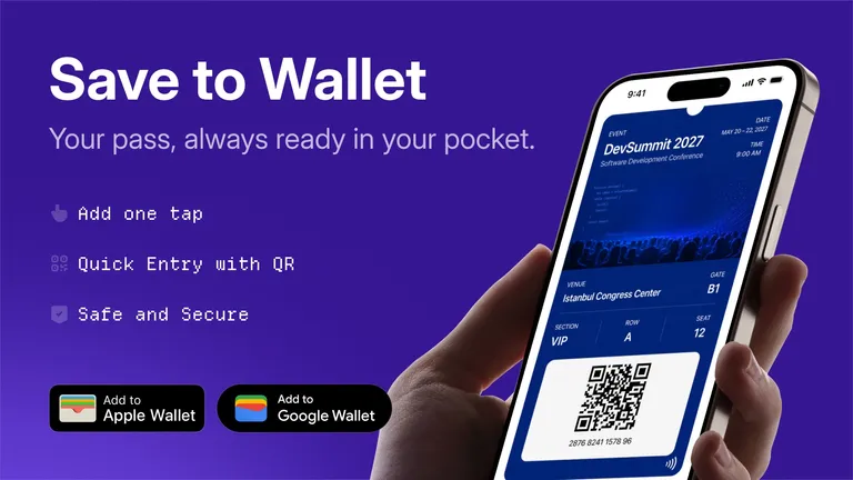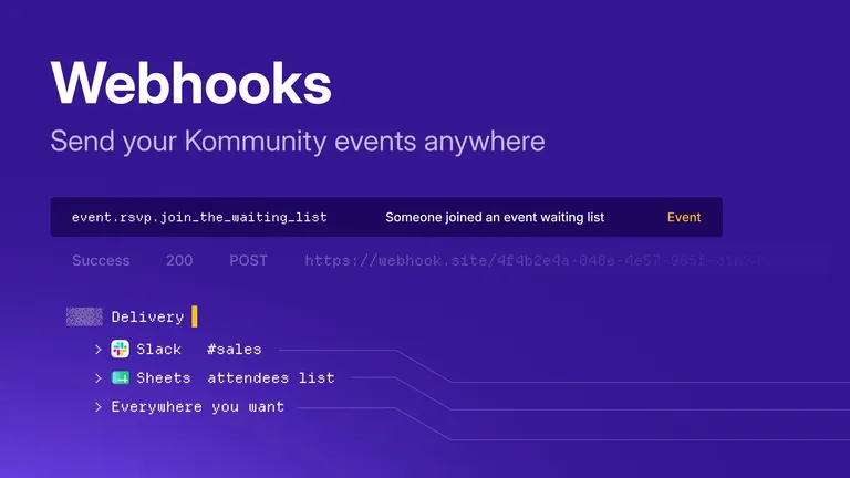
We redesigned the event page on Kommunity. Every event can now go live with a theme that fits your community's character. There are 18 color themes, each with its own light and dark version, and you choose one from the organizer panel. Nothing changes for your existing events.
Why a new event page?
The event page is the most shared page a community has.
When an event gets shared, the event page is the first thing an invitee sees. Often it's where they meet the community for the first time. But the old page was the same for everyone: the same gray background, the same layout, the same accent color. A software meetup and a design night, a hackathon and a career panel all went out in the same shell.
With the new page we worked on two things at once. We rebuilt the layout around the information that actually matters for an event, and we handed the page's visual identity to the organizer.
The new event page
The page is split into two columns. The left column holds the event's identity: the featured image, the hosting community with its subscribe action, hosts, speakers and attendees, the location on a map, and photos from past events. The right column holds what people need to decide: title, date and time, address, the registration block, description, sponsors, schedule and comments.
The registration block now sits in the most visible spot on the page and changes shape with the event's state. Registration open, registration waiting for approval, event ended, event canceled: each is its own state, with its own message and its own action.
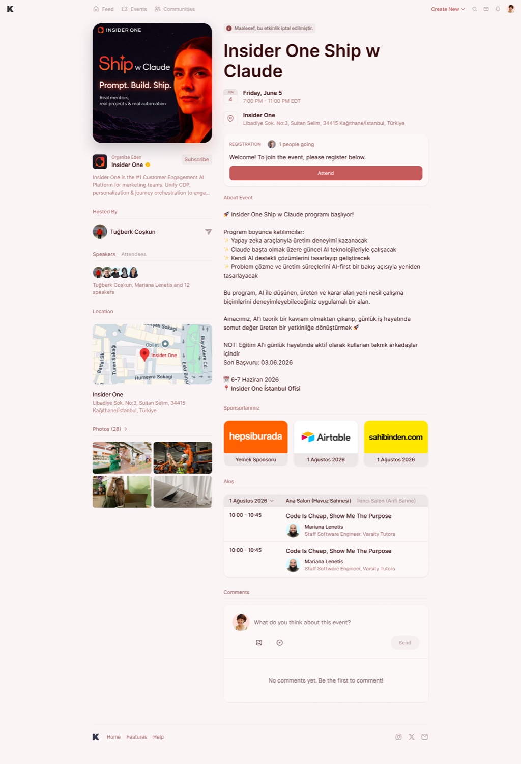
The themed event page, top to bottom. The banner at the top says the event has been canceled; the registration block, sponsor cards and per-room schedule all use the theme's colors.
- Schedule by room. Multi-room events let visitors pick a day and a room. Every session is listed with its speaker and their title.
- Speakers and attendees. Two tabs in a single block. Full lists open in a modal, so the page doesn't grow.
- Location and map. In-person events show the address together with the venue pinned on a map.
- Sponsors. Sponsor logos get their own cards, with the sponsorship type and date.
- Built separately for mobile. On mobile the two columns don't just stack. The registration action is arranged to stay within reach.
- No blank screen. Until the data arrives the page shows its own skeleton, and the theme doesn't flash from one color to another.
The choice is the organizer's: Classic or Themed Design?
We didn't want to force the new design on anyone. In the organizer panel, at the top left of the event form, right under the featured image, there are two cards: Classic and Themed Design. Classic is the page you already know. Themed Design is the new themed page.
As soon as you pick Themed Design, two settings open underneath: Color and Display. The small preview inside the card updates with every choice, so you see what the theme looks like before you publish.
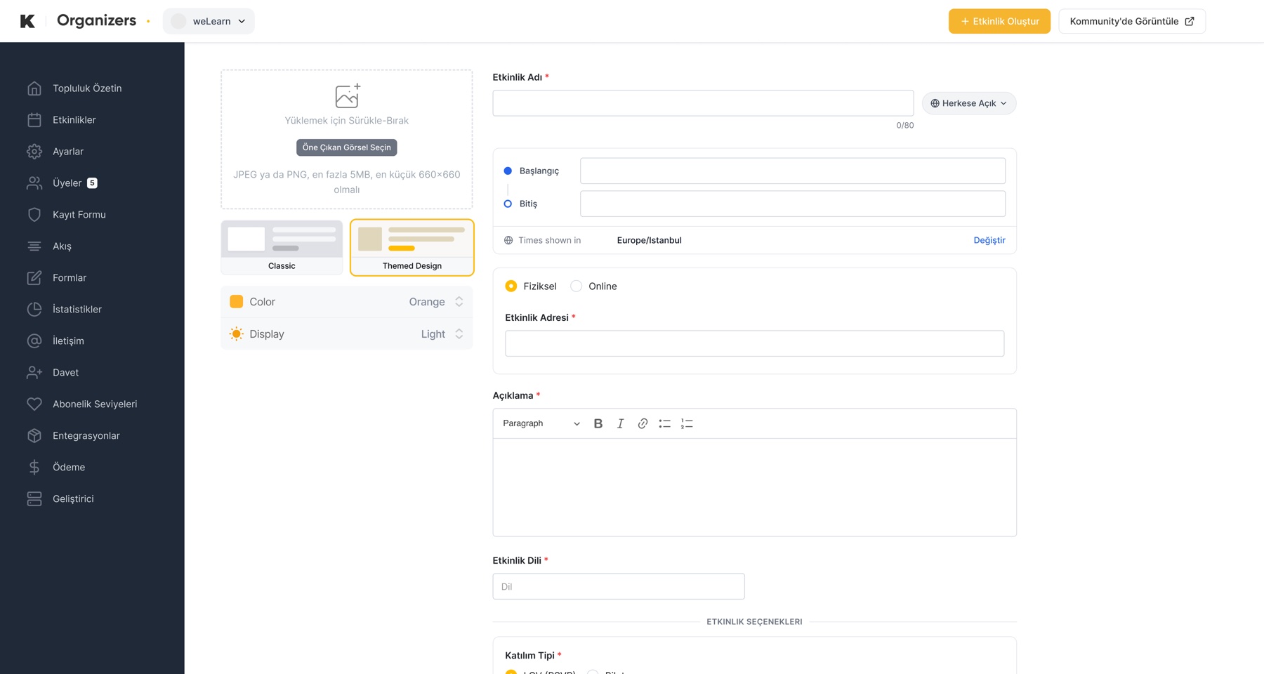
The design choice lives inside the event form. There's no separate screen to visit; it sits in the left column while you create the event.
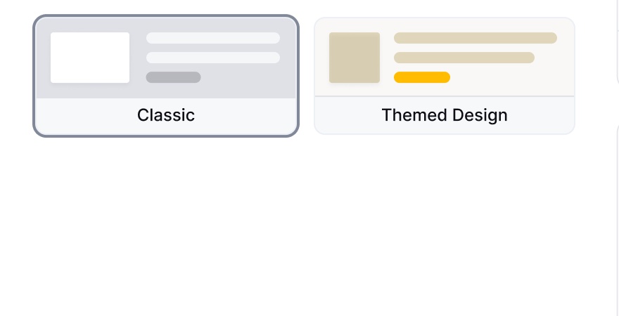
Classic. No extra settings; the event is published on the classic page.
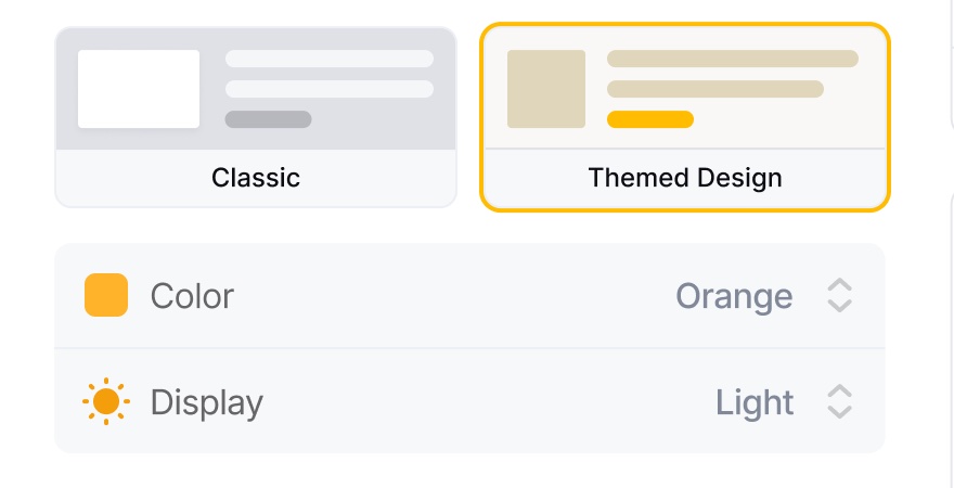
Themed Design, light preview. The Color and Display rows open and the preview takes on the theme.
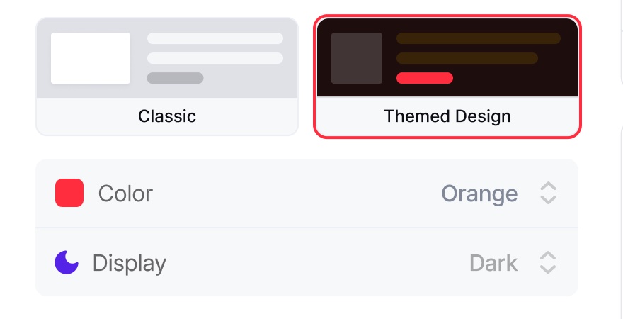
Themed Design, dark preview. The same theme in its dark variant.
18 themes in two families
Open the Color menu and 18 themes appear in a single row. These aren't randomly picked colors: each one was built as a palette that works from top to bottom. A small divider in the menu separates the two families: 11 solid themes and 7 themes with a moving background.

The Color menu. Solid themes to the left of the divider, animated ones to the right. The selected theme gets a check mark and the preview card repaints right away.
Solid themes. A fixed brand color, with text, surface and button tones built around it.
| Theme | Brand color | |
|---|---|---|
| Default | #FFBC00 |
|
| Base | #C45A5A |
|
| Purple | #682FFF |
|
| Pink | #F72585 |
|
| Magenta | #B832E6 |
|
| Electric Purple | #6C2DFF |
|
| Royal Blue | #006BFF |
|
| Emerald | #00B84A |
|
| Golden | #E49A22 |
|
| Tangerine | #FF6B35 |
|
| Signal Red | #FF2D3D |
Animated themes. In these seven themes the background isn't static: a gradient drifts slowly between three colors. The swatches below use each theme's actual animation colors.
| Theme | Gradient colors | |
|---|---|---|
| Dream | #808AFE, #9880FF, #7FDDFF |
|
| Lavender | #BC80FE, #8FA8FF, #FFA3E8 |
|
| Forest | #80FFE4, #80FF93, #B2FF80 |
|
| Ocean | #81EEFE, #80CBFF, #7FF5FF |
|
| Sunset | #FF9E7F, #FFC178, #FF7F98 |
|
| Melon | #A9E19C, #FFF581, #FF8080 |
|
| Summer | #FFC96B, #6BD8D2, #69A8F2 |
Accessibility. Motion isn't comfortable for everyone. For visitors who have "reduce motion" turned on in their operating system (
prefers-reduced-motion), the background animation stops completely and the page shows the same colors, standing still.
Every theme was designed twice: light and dark
Each theme comes in a light and a dark variant. We didn't get the dark one by automatically inverting colors. We designed the light and dark variant of every theme separately. In the dark variant we picked button tones, link colors and surface transparencies again from scratch, for readability. A yellow that works on a light background doesn't do the same job on a dark one.
The Display setting in the panel lets you preview both variants before you publish. On the live page, each visitor sees the variant that matches their own light or dark setting on Kommunity, so the page follows the reader rather than forcing one look on everyone.
Light variant
Scaling UIs with Vue
Friday, June 5 · 7:00 PM - 11:00 PM
Attend
Add to calendar
Dark variant
Scaling UIs with Vue
Friday, June 5 · 7:00 PM - 11:00 PM
Attend
Add to calendar
The same theme, two separate definitions. The brand color (#FFBC00) stays in both variants, but the link color changes: a deep amber on the light background (#8F6900), a light yellow on the dark one (#FFC729). Automatic inversion wouldn't give you this; we picked both values one by one.
Under the hood
For anyone curious how it's put together.
One field carries the theme
The organizer's choice is stored in a single field on the event: theme_name. Every decision on the frontend comes from that field. When an event page opens, a small switcher component steps in and renders the classic page if theme_name is empty, or the themed page if it's set.
// Events without a theme_name keep the old design;
// events with a theme get the new themed page.
showOldDesign () {
  // The decision can only be made once the event data is in;
  // while it loads, the themed skeleton is shown.
  return this.hasEvent && !this.eventData.theme_name
},
activeComponent () {
  return this.showOldDesign ? DetailsNew : ThemedEventPage
}
Not deciding before the data arrived mattered. Otherwise the page painted itself in the default theme first, then switched themes in front of the visitor when the data landed.
If you use our webhooks, event.created carries the same theme_name.
A theme is 17 design tokens
Every theme is a set of tokens, defined separately for its light and dark variant. There isn't a single hard-coded color on the page; every component reads from these tokens. So adding a theme doesn't mean writing a new CSS file, just filling in one more copy of the set.
brand_color textPrimary textSecondary textTertiary textPassive textOnAction textInverse pageBg surface surfaceHeader surfaceStroke divider actionTertiaryBg buttonPrimary buttonHover linkText iconButtonBg
At runtime, the active theme's tokens are written to the page root as CSS custom properties (--event-*). A theme change happens in one place, and the hundreds of rules underneath never need to be touched.
The theme doesn't stop at the content area
While a themed event page is open, the top menu, the footer and modals follow the event's theme too. A marker class on the page body maps the app's general theme variables to the event's tokens, so there's no frame in the "old colors" around the themed content.
Backward compatibility
We didn't touch a single existing event when we rolled out the new page. Events without a theme_name keep working exactly as before, and both designs live side by side under the same route. That meant no big migration at all.
Note. While building this we try themes on live pages with a side panel. That panel only opens in local development and on our test environment; it never renders in production. The choice isn't saved either: refresh the page and the event's real theme comes back.
Pick a theme for your event
When you create a new event or edit an existing one, select the Themed Design card in the organizer panel and choose the color that suits you. As soon as you save, your event page goes live with the new design.
If you'd rather stay on the classic design, you don't need to do anything. Your existing events carry on as they are.